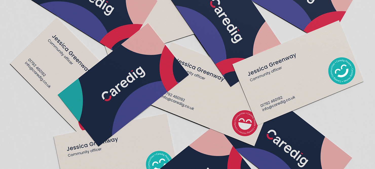
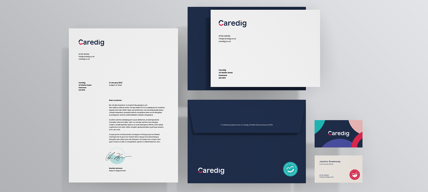
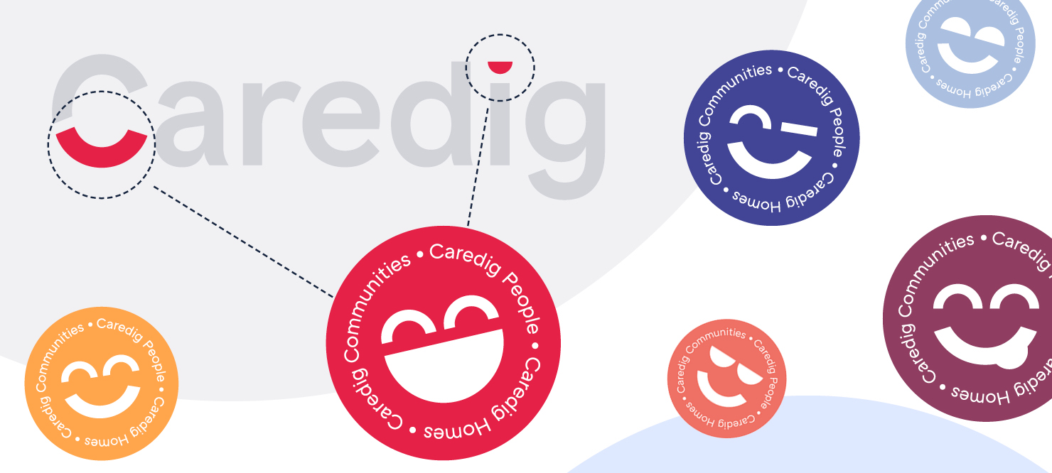
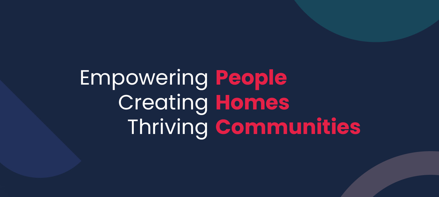
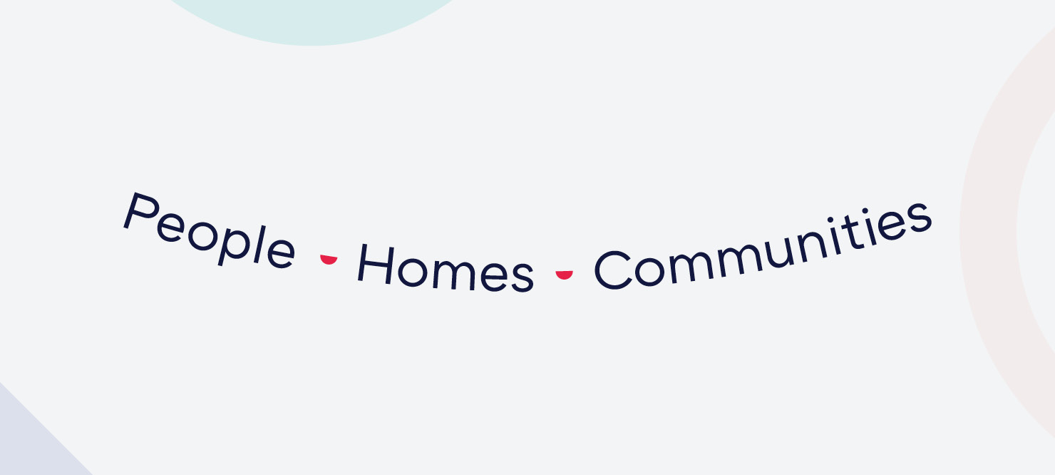
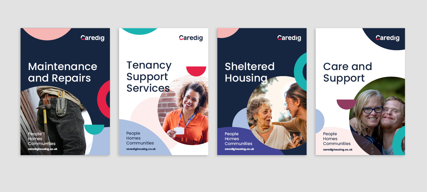
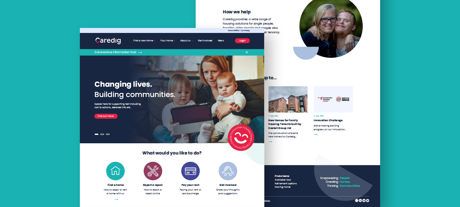
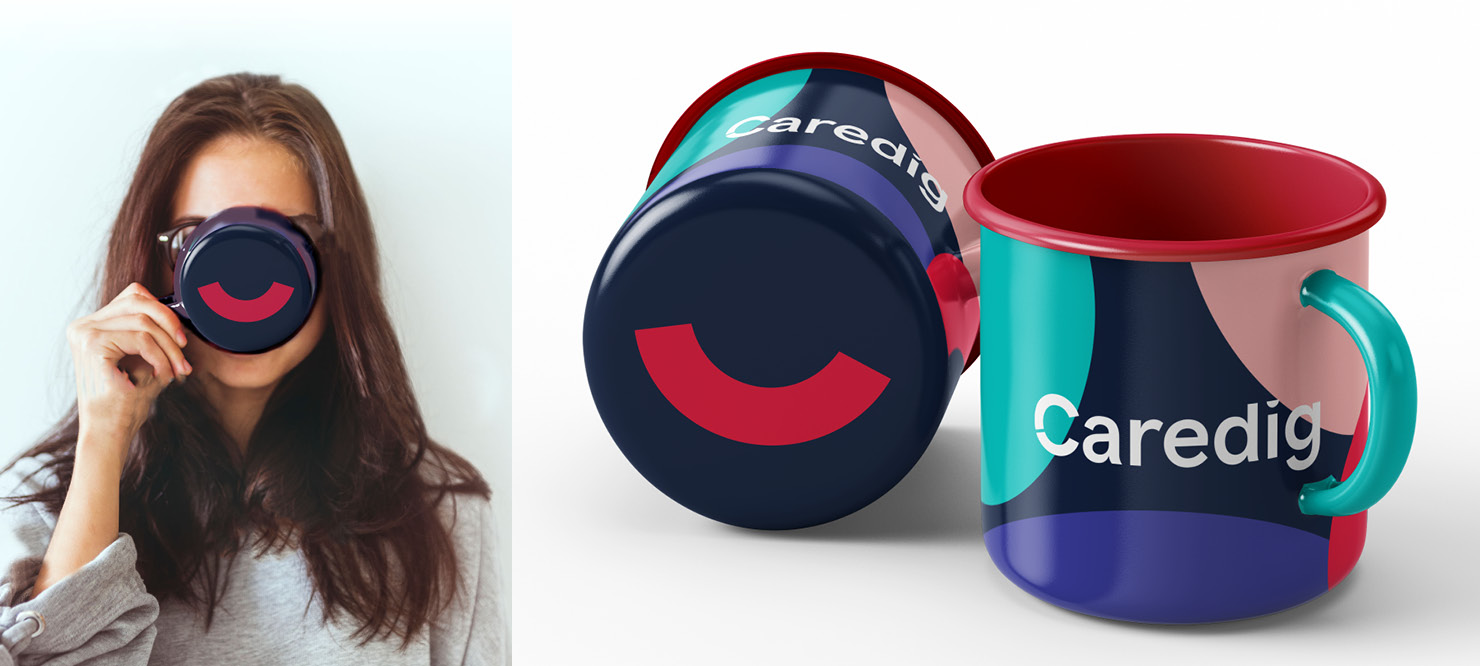
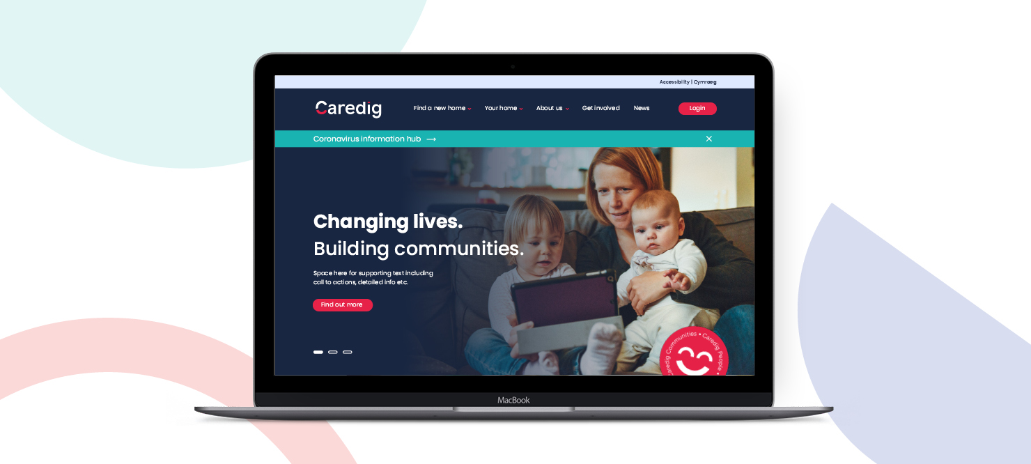
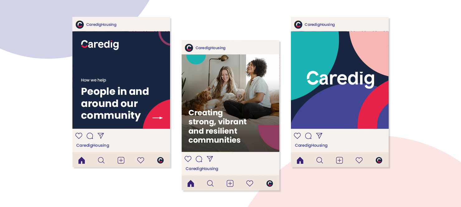
Creating a brand
with kindness at its heart

Family Housing were evolving. To support their strategic objectives, it was identified that their existing brand name, identity and positioning needed to be refreshed.

Services

  • Naming
  • Brand Positioning
  • Brand Identity
  • Brand Messaging
  • Website Design
  • Brand Literature

INDUSTRY CONTEXT

As Family Housing strove to support more people, deliver modern, reliable services and build more homes, they required an identity to reflect their ambition. Something bold, flexible and authentic to take them forward.

Challenge

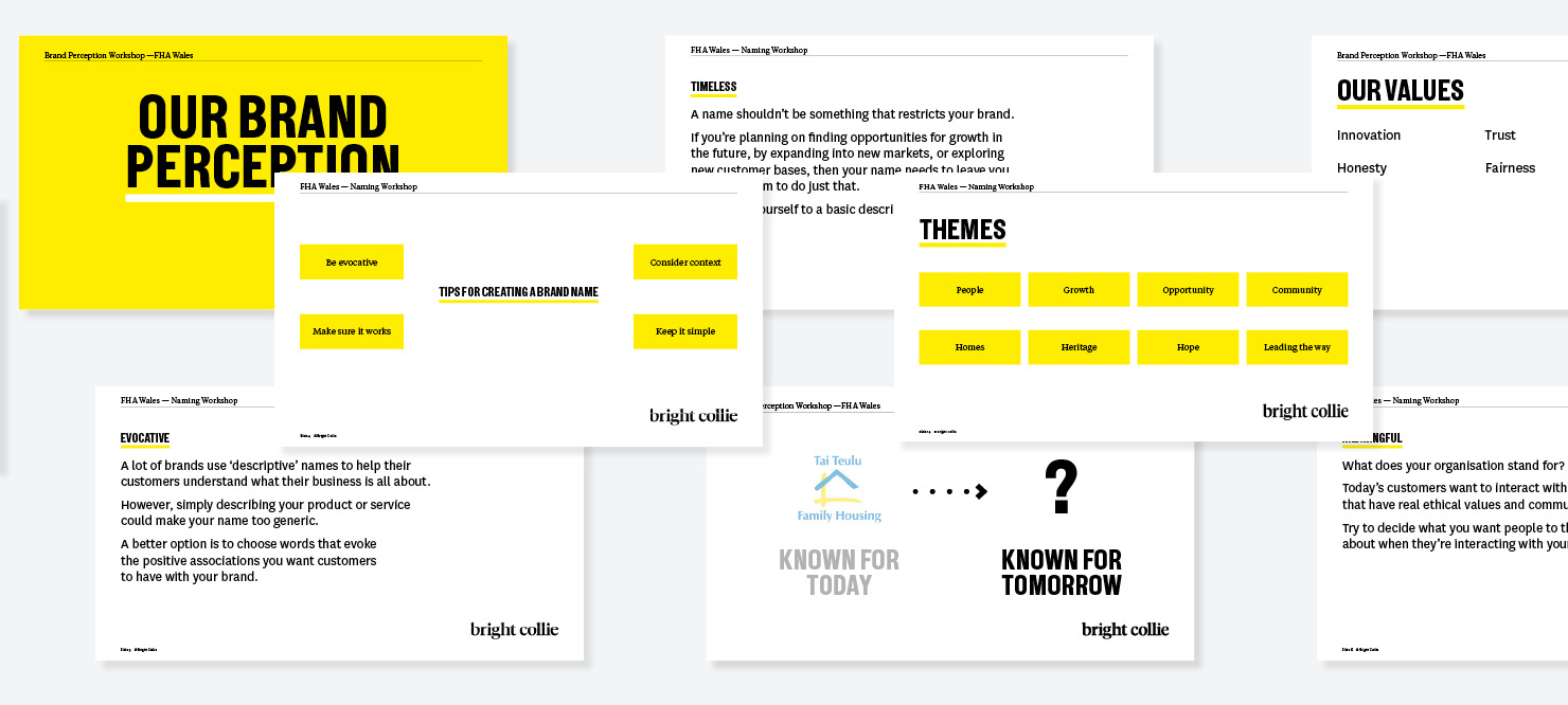
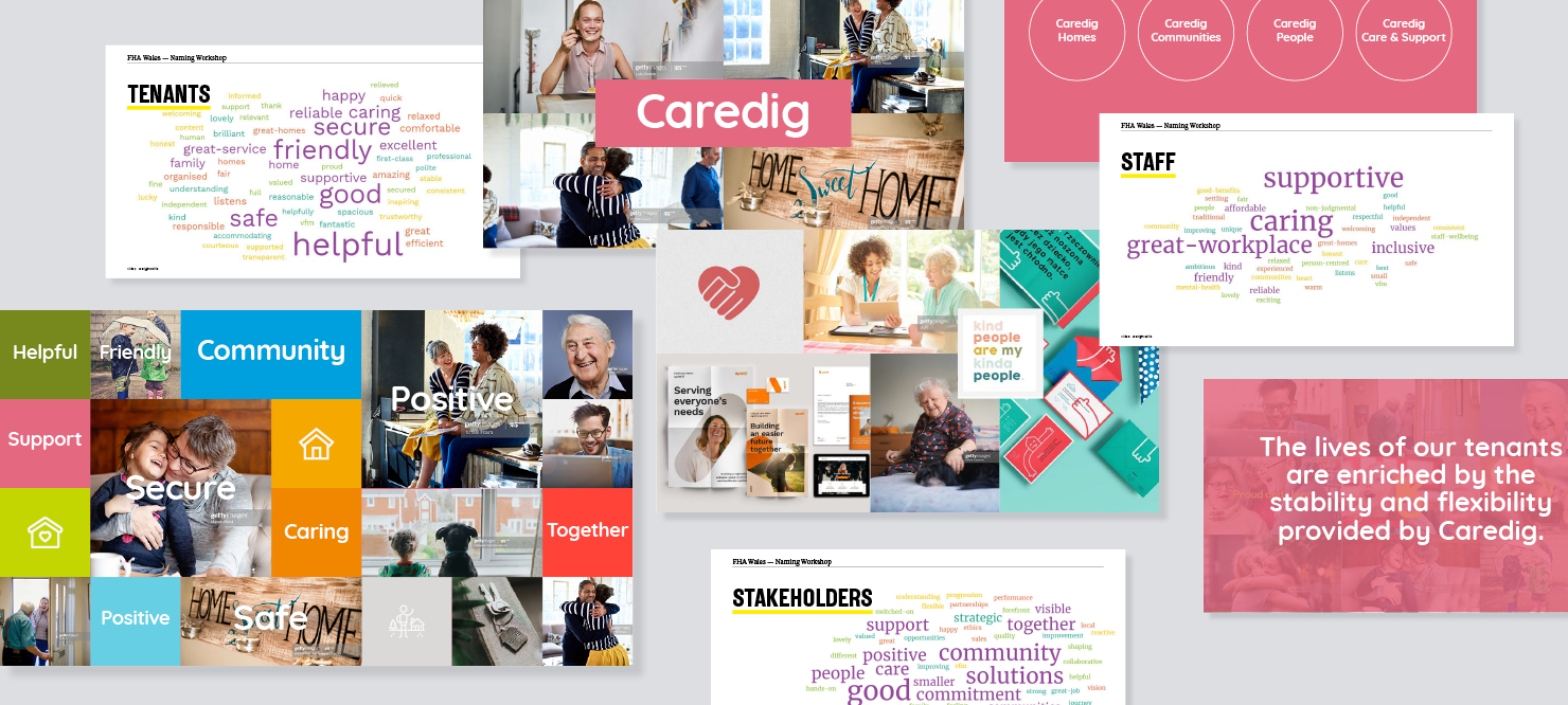
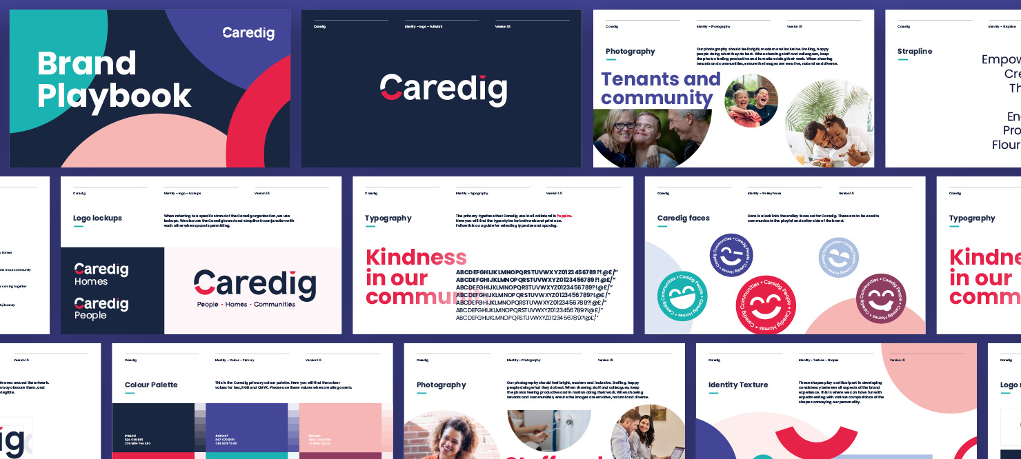
Family Housing required a brand proposition that reflected their mission, represented the people they serve and the people within the organisation. We were tasked with creating a name that supports what they’re about, as opposed to what they do. A name that doesn’t limit them to a particular service or geographical area. Following that, we needed to create a visual identity that best represents the organisation, their people and its communities.

Naming

Through our proven process of name development, which is collaborative, inclusive and linked to the brand strategy, stakeholders were led through the journey of developing a name for the organisation. Caredig means ‘kind’ in Welsh. Kindness is at the heart of the organisation, which focuses on the delivery of person-centred services.

Identity

A custom logotype was created to capture each smile or impression from the people behind Caredig and the surrounding community. It was important that the logotype was clear and legible, ensuring that the pronunciation is accessible to non-native Welsh speakers and fluent speakers alike.

Messaging

The brand personality was built around the core proposition of 'Kindness in our community'. We developed a tagline of People, Homes, Communities.

Identity Application

We brought the new brand to life through infusing emotive, natural and inclusive photography with the brand device throughout all collateral and literature. Used to communicate the playful and softer side to Caredig, the shapes and smiles play a critical part in developing consistency between all aspects of the brand experience. Experimenting with various compositions of the shapes convey the desired personality.