HELLOSPARK
A brand to spark change.

Empowering a business through a new name and identity.
Hellospark, a pioneering company based in France, aims to drive change and innovation while fighting for a low-carbon future.
Hellospark specialises in transforming spaces such as car parks into renewable energy hubs using their cutting-edge photovoltaic canopies. Hellospark sought a brand identity to reflect its innovative spirit, personality and ambitions.
Brand Strategy, Brand Identity, Brand Guidelines, Website Design, Print Design, Digital Assets
For the housing association Valleys to Coast, the way that the repairs and maintenance arm operated was broken. The entire process from customer to company was fragmented and frustrating, thus needing a new sister company to adapt to the needs and expectations of its clientele.

The challenge
Hellospark needed a brand identity to differentiate itself in a highly competitive sector where green and blue tones dominate the visual landscape.
The challenge was creating a brand that stands out and embodies Hellospark’s mission to innovate and lead change. The brand needed to communicate the company’s dynamism while resonating with its commitment to sustainability and technological advancement.
The Brand Idea
The brand idea revolved around the concept of sparking change. To celebrate the founding principles of the business, which are to instigate change and be a positive force.
We wanted the brand to convey the energy, innovation, and forward-thinking mindset of the Hellospark team.


Developing the brand identity
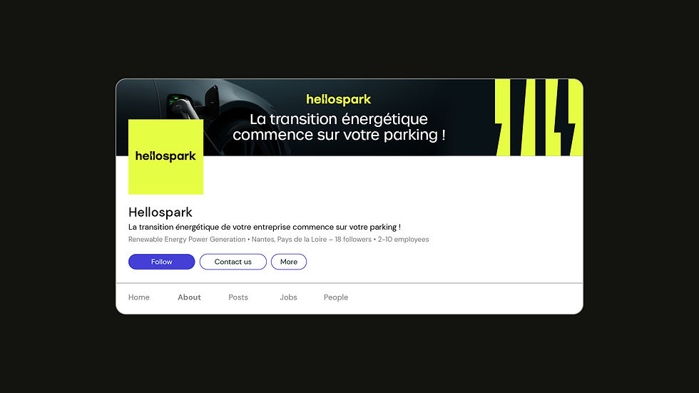
We crafted a bespoke logotype where the negative space between the characters forms a lightning bolt. It symbolises the energy that Hellospark harnesses and the company’s role as a catalyst for change in the sector.
The lightning bolt from the logotype was more than just a clever design element — it became a bold and dynamic graphic device used across all brand collateral, creating a consistent and impactful visual language that reinforces Hellospark’s identity.
To set Hellospark apart in the sea of green and blue prominent in the sector, we chose a bold colour palette to aid with differentiation and represent the brand’s innovative and energetic personality.
The yellow tones evoke the brightness and potential of solar energy, while the black provides a contrast that conveys authority and expertise.
Outcome
Hellospark has a name, an identity and a visual toolkit that captures the company’s essence and helps set it apart in a congested sector.
The brand portrays a sense of confidence, assurance and innovation.
Feedback from Hellospark and its partners has been overwhelmingly positive. The branding has enhanced its market presence and strengthened its position as a key player in the renewable energy and electric mobility sectors.


Find out more
If you’d like to learn more about how we collaborated with the team at Hellospark to move them to a better place, feel free to get in touch.
We’d love to chat if you’re a brand working towards a low-carbon future that needs to evolve and get ahead of the flock.
Call us on: 01443 237717
Email us: whistle@brightcollie.com
The team at Bright Collie has been exceptional in guiding us through the rebranding of Hellospark. They listened carefully to our goals and brought a creative energy that elevated our vision. The result is a brand identity that not only resonates with our mission but also positions us strongly in our industry.
Their professionalism, creativity, and attention to detail made the entire process enjoyable and highly productive. We’ve already seen positive reactions from our clients and stakeholders. I highly recommend Bright Collie for any branding project.
Pauline Bailly – Responsable Marketing, Hellospark