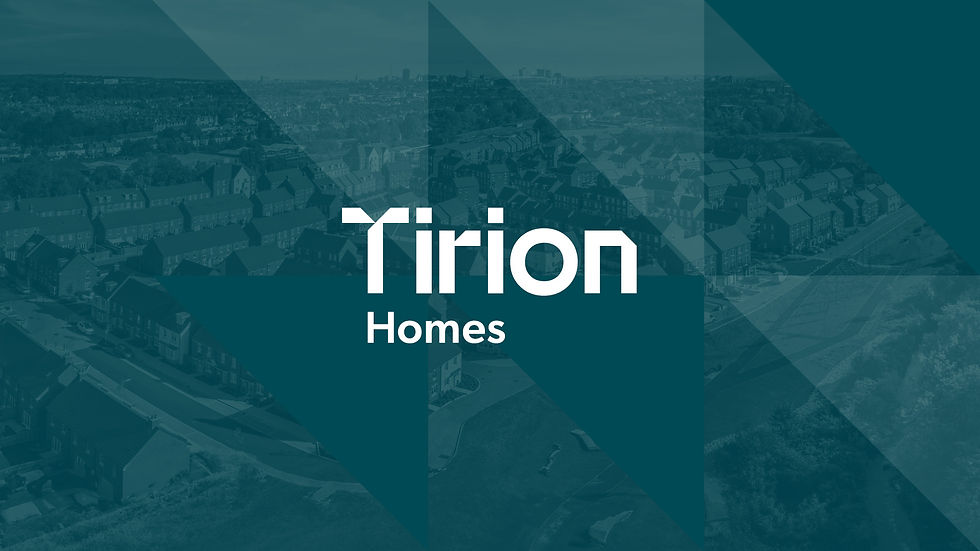
tirion homes
Building a better future. Today.
A rebrand grounded in the need for clarity, consistency, and renewed confidence in the brand.
Tirion Homes creates aspirational and sustainable communities through innovative approaches to financing by undertaking regeneration schemes primarily based on brownfield sites.
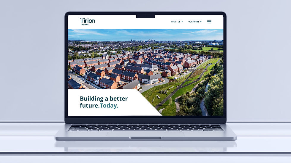
Brand Strategy, Brand Identity, Brand Guidelines, Website Design, Print Design, Digital Assets


The challenge
Through a series of stakeholder workshops and surveys, it became clear that as the Tirion Group had grown, its brand identity had become diluted, and lacked cohesion, leading to confusion among stakeholders.
An important phase of this rebranding process was to review and agree a naming convention for the brand as ‘Group’ was deemed too ambiguous. Having clarity with this aspect would position the brand to move forward with confidence, enhance their engagement with external stakeholders and strengthen the brand presence in the market.
The Brand Idea
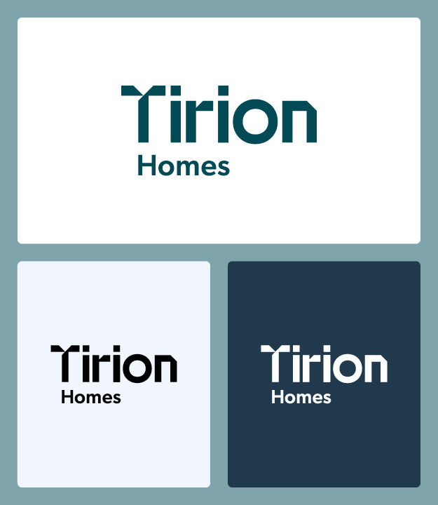
Moving forward we proposed the brand to be marketed as Tirion Homes to all audiences, including customers, partners, stakeholders, and funders. The name, Tirion Homes, provides clarity on the businesses core purpose — delivering and managing affordable, high-quality housing and builds a platform for the business to tell a story, to be consistently identified and to be remembered.
To support this narrative, we created a new brand identity that is clever, approachable, reassuring but also progressive and dynamic. Within the core logo, we have designed elements that allude to building blocks and construction — a core part of the business’s DNA — but can also adapt to bring the core values of Collaboration, Innovation, and Excellence to life.
The shapes suggest active movement. A way forward.


Outcome
More than a visual update, the rebrand was a strategic move to enhance engagement with external stakeholders, strengthen market presence, and lay the foundation for long-term growth aligned with Tirion Homes’ mission, vision and purpose.
The intention was to help position Tirion Homes as a leader in creating vibrant, affordable communities that address housing challenges through sustainability and design excellence.
Since the rebrand, it’s been fantastic to see the new identity supporting Tirion’s ambitions — including increased stakeholder engagement and the momentum behind recent milestones, such as being awarded £24.5 million in funding for 114 new homes in South Wales. This included the largest-ever investment by the Development Bank of Wales.


Find out more
If you’d like to learn more about how we collaborated with the team at Tirion Homes to move them to a better place, feel free to get in touch.
We'd love to chat if you're a brand looking to reenergise, evolve, and carve out a brighter future ahead of the flock.
Call us on: 01443 237717
Email us: whistle@brightcollie.com
Working with Bright Collie has been a game-changer. The brand they created doesn’t just look great – it reflects who we are and where we’re heading. It’s already helping us open new conversations and opportunities.
Mark Howells
Housing Director – Tirion Homes